Toki
(01)
The Challenge
Money made for Gen Z
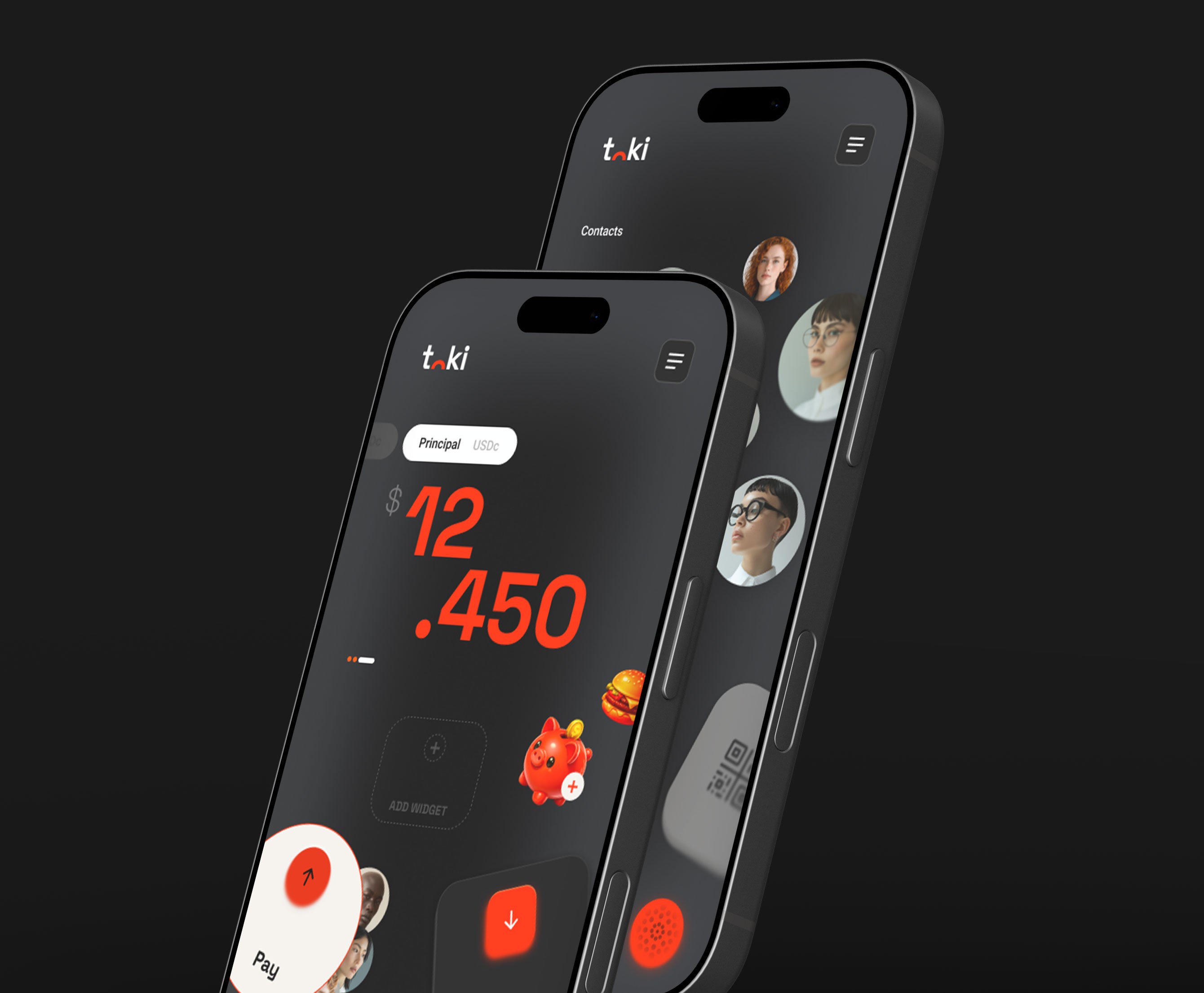
Toki is a digital wallet designed around how Gen Z actually uses money: quickly, socially, and without unnecessary complexity.
The challenge was to create a financial product that feels less like traditional banking and more like something that naturally belongs in their everyday lives. Simple, personal, expressive, and built around what they actually need.
My role
Brand designer & Creative Director
Made at Bien & Hecho

(02)
Insight & Idea
The idea was simple: everything you can carry in your pocket.
Pay, move money, split expenses and transfer between friends. Nothing more than what you actually need.
This simplicity became the foundation for both the product and the brand: a digital wallet stripped down to the essentials, designed to feel immediate, intuitive and personal.
Organized chaos
The visual identity turns that simplicity into a bold and expressive system inspired by the visual language of Gen Z.
Unexpected compositions, overlapping elements, spontaneous photography and playful objects create a controlled sense of chaos. Bright colors and graphic elements collide freely across layouts, while a strong underlying system keeps everything recognizable as Toki.
The result is an identity that feels loud, playful and unapologetic without losing clarity or usability.




Rollout
& Outcome
Made to be yours
The system was designed to move naturally across the entire Toki experience, from the app and digital card to social content, OOH, merchandise and physical objects.
Inside the product, agentic AI takes the idea one step further, allowing users to customize their experience and make Toki their own.
A wallet reduced to what matters, wrapped in an identity designed to be anything but ordinary.