(01)
The Challenge
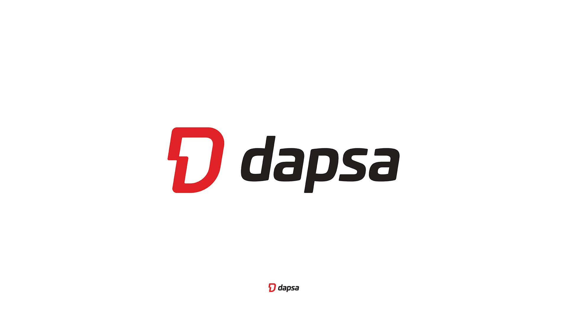
Movement
you can trust
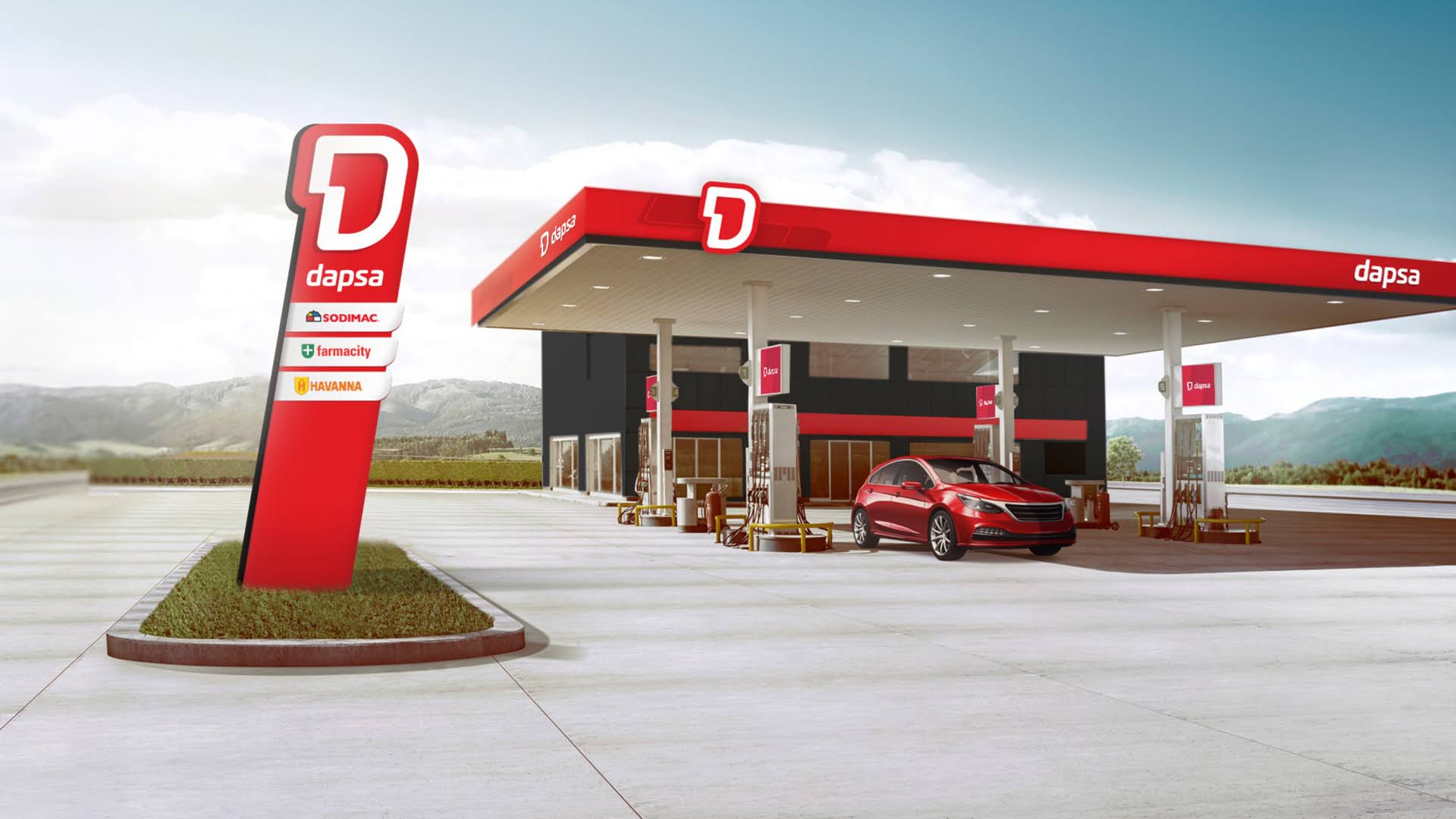
Dapsa, a national fuel company with service stations across Argentina, needed a brand identity that could stand out in a category dominated by large, established players.
The challenge was to create a brand that communicates energy and performance, while also feeling close, approachable, and trustworthy for everyday drivers.
My role
Principal Brand Designer

(02)
Insight & Idea
Fuel brands often lean into power and performance, but tend to feel distant and corporate.
For Dapsa, proximity was key.
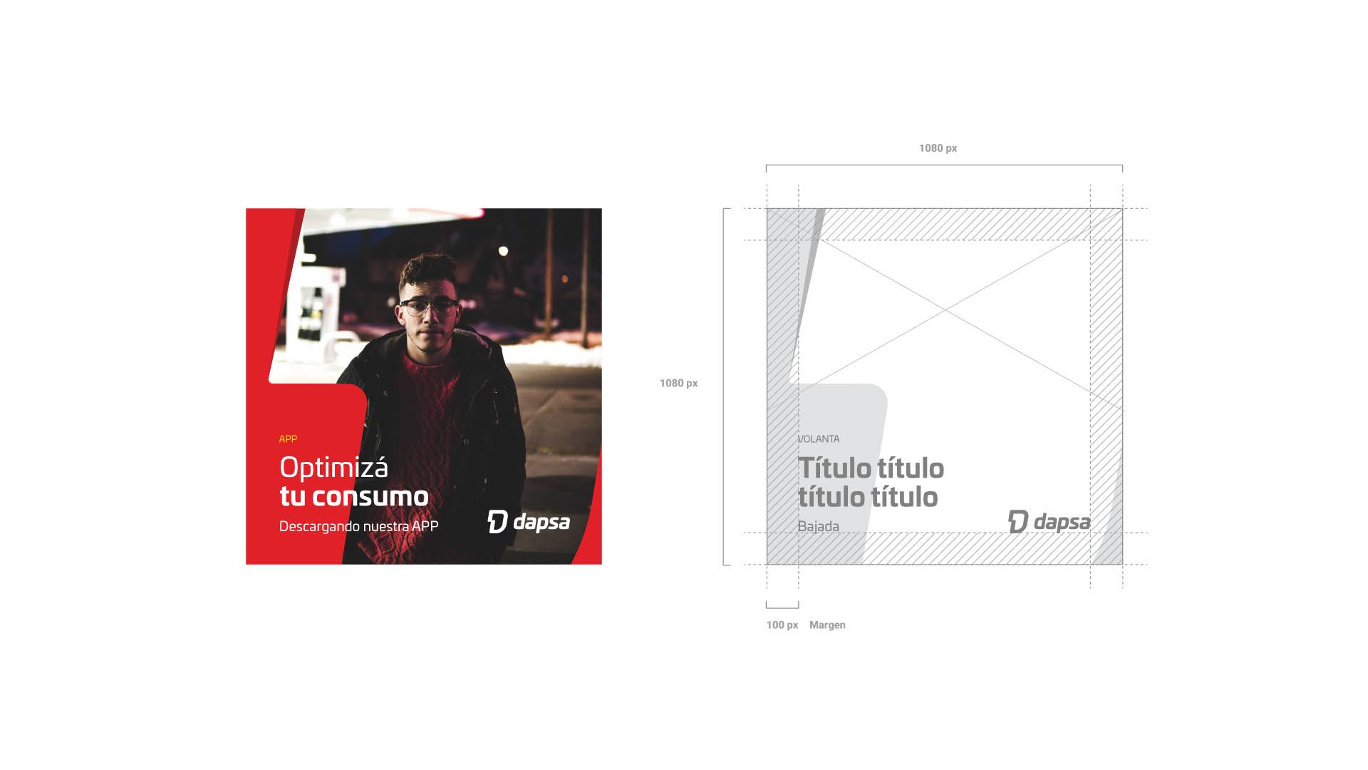
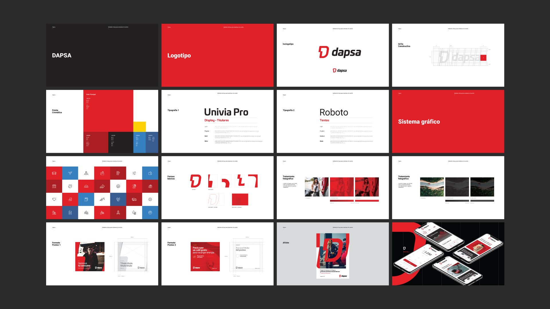
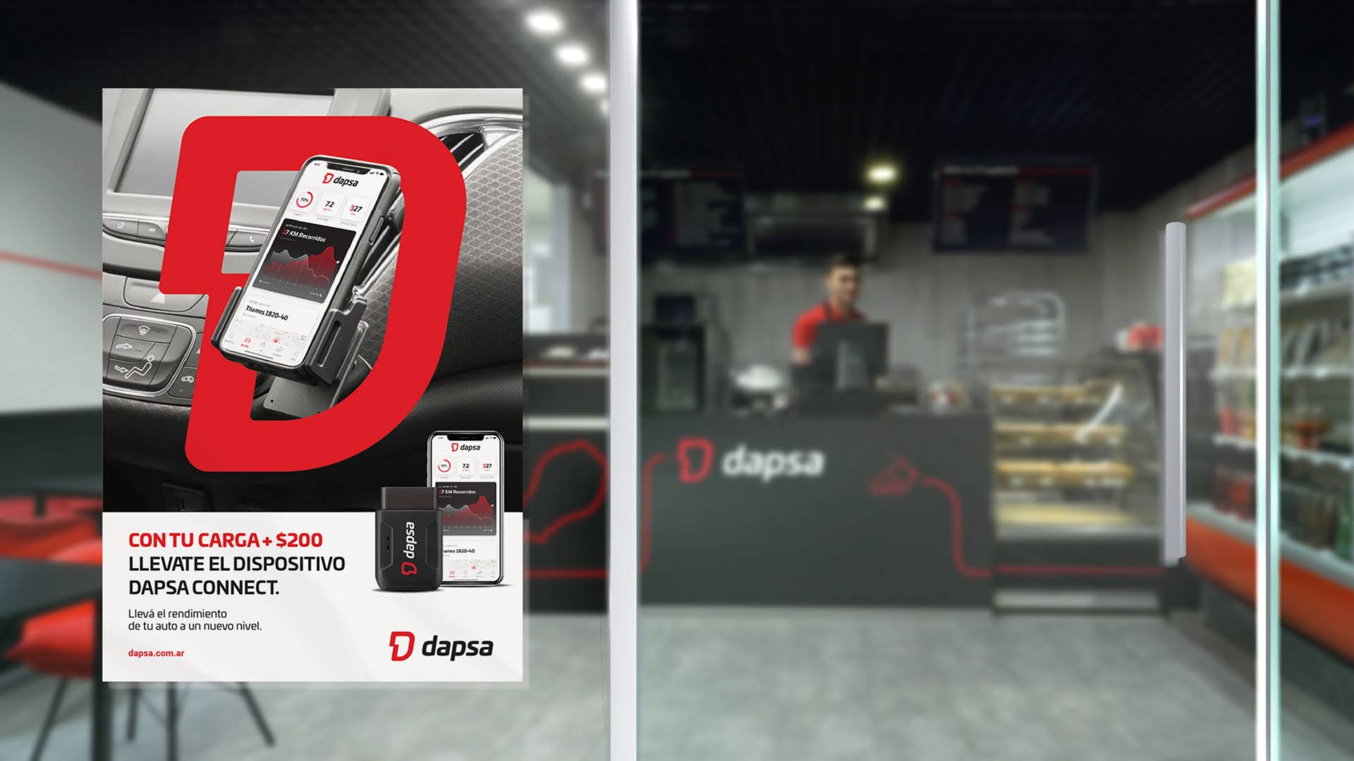
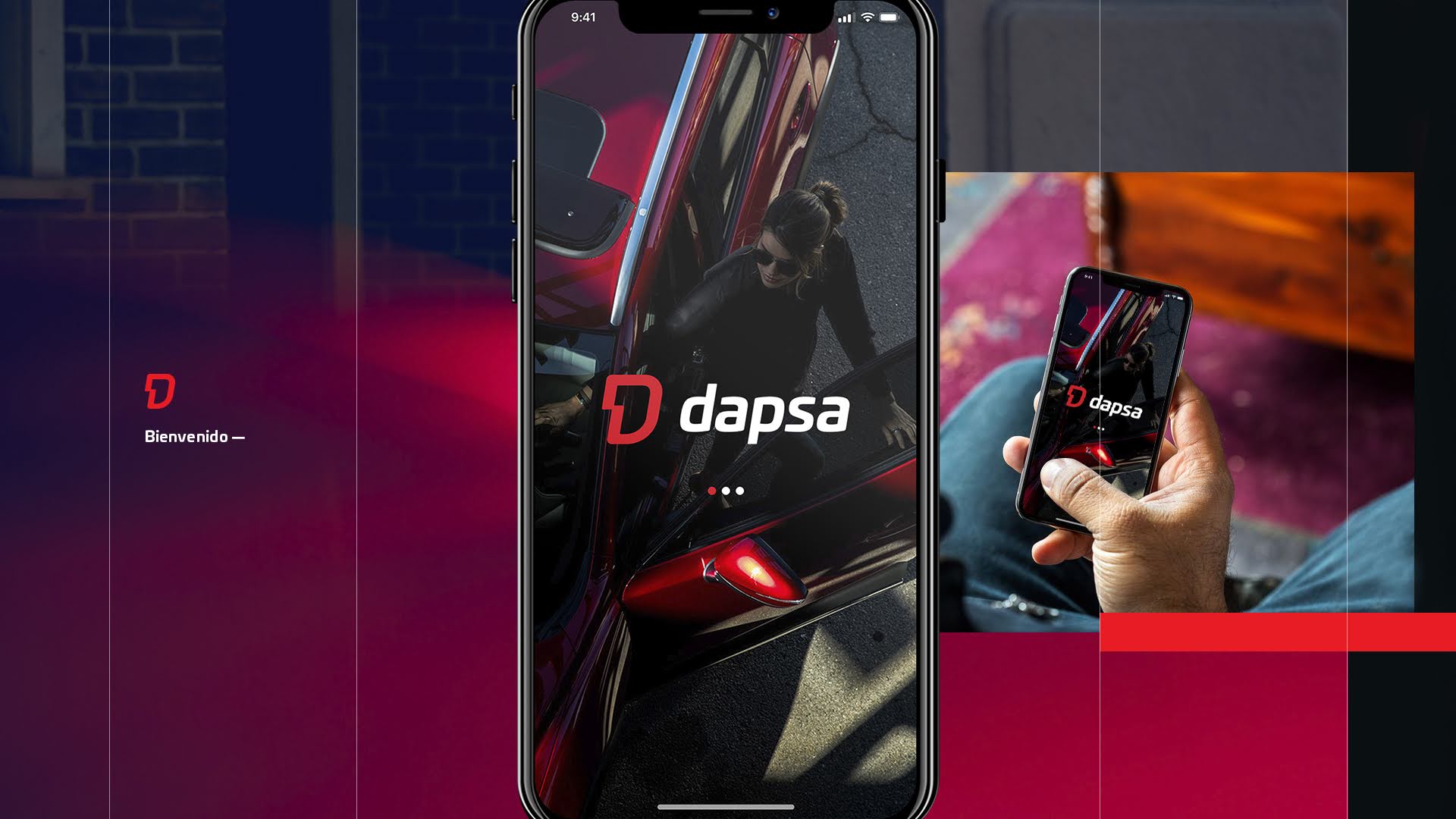
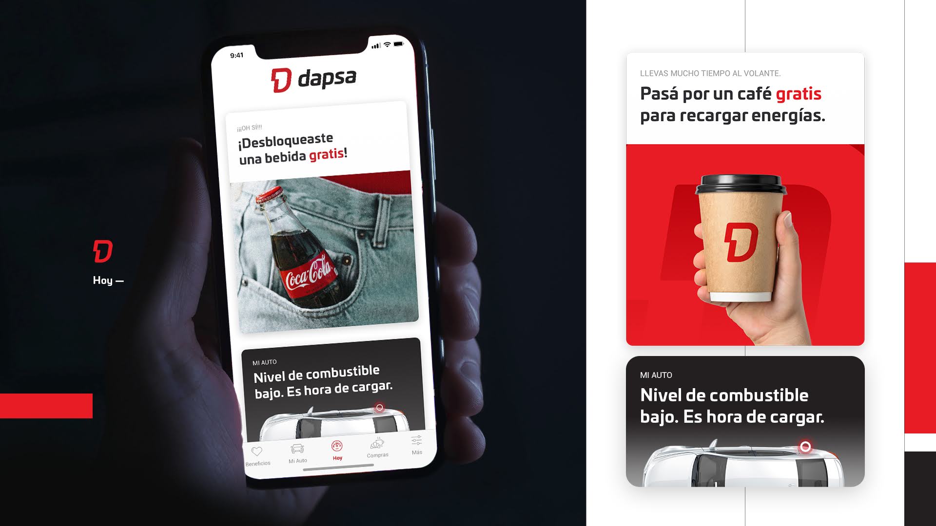
The identity was built around the idea of movement with closeness, combining energy and flow with a more human, accessible tone. A brand that feels dynamic on the road, yet familiar and reliable at every stop.
The visual system is defined by fluid, curved forms that express motion and continuity, paired with a lowercase typographic approach that softens the tone and reinforces accessibility.
This balance between power and approachability creates a distinctive identity within the category, translating technical performance into a more human and relatable experience.

Rollout
& Outcome
The identity positions Dapsa as a closer, more approachable alternative within the fuel market, building trust through design while maintaining a strong sense of energy and movement.